Why Don't I Like of AIRBNB?
I, of course, use the services of this service, but I turn to it only after I have exhausted the possibility of finding a suitable place to live in Booking.com and there are many reasons for this. The first thing that makes a negative impression is the terrible design of the site. Initially, the site was quite sane and functional, it worked without delays, but "creative designers" got to it and now the site is very heavy even for a powerful desktop computer. The same goes for the mobile app, which only works fast on expensive and powerful gadgets.
Navigation
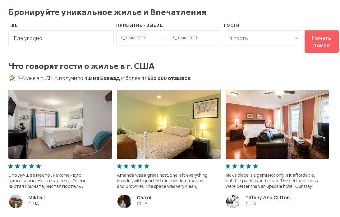
The first thing the client sees is the housing search bar, which is exactly what they need. Everything would be fine, but in addition to this simple field, the page is filled with completely extraneous information, in my case -" what guests say about housing in the United States." I am completely uninterested in housing in the United States, and especially reviews about it, I need to find housing completely in the other side of the world.
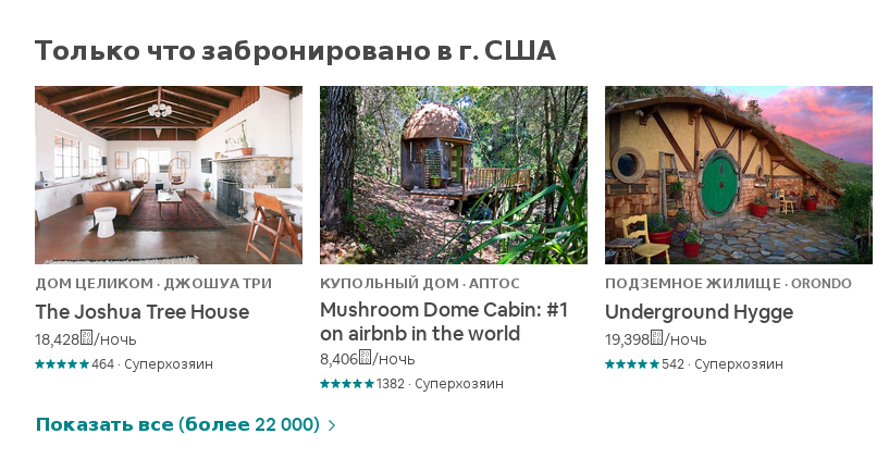
And what use does the information "Just booked in the USA"have for the customer? This could be ignored, but because of these colorful images, the page loads for about twenty seconds even with fast home Internet, and on a mobile device it takes at least a minute.
How to log in to an account or register on the main page there are no instructions and despite the fact that I have been using the site for a long time, every time there are difficulties. After a long fidgeting around with the cursor on the page, I poke at random at the Airbnb logo, to which the "creative designers" did not bother to add a popup hint. The next page opens, and there is already a menu bar where the desired "Login"is located.

Here, too, there is a lot of diversity, "Impressions", "adventures", "Restaurants", "Reviews", again a lot of offers of houses, now all over the world...here is the fuck I gave up "Castle-Tuentine-palms" the devil knows where (even the country is not specified), if I'm looking for a cheap room in Prague? It seems that the site's design was developed by a person who was far from traveling and had no idea what the client needed. A person comes to such sites to find housing of a known price category and in a known place, and they give him "Cycladic house · OYA" and beaches in Cape town? And for absolutely insane money, which can scare off the client, most of whom come here for budget housing - this is the only value of this service.
Search for housing
Entering the desired city and dates of residence, we get the first thing again: "Impressions with the best ratings", "Book events organized by local hosts", "Excursions with local guides". It seems that the creators of the site do not realize that people who plan their own trip will somehow inflate what they want to visit, and are unlikely to use the services of guides.
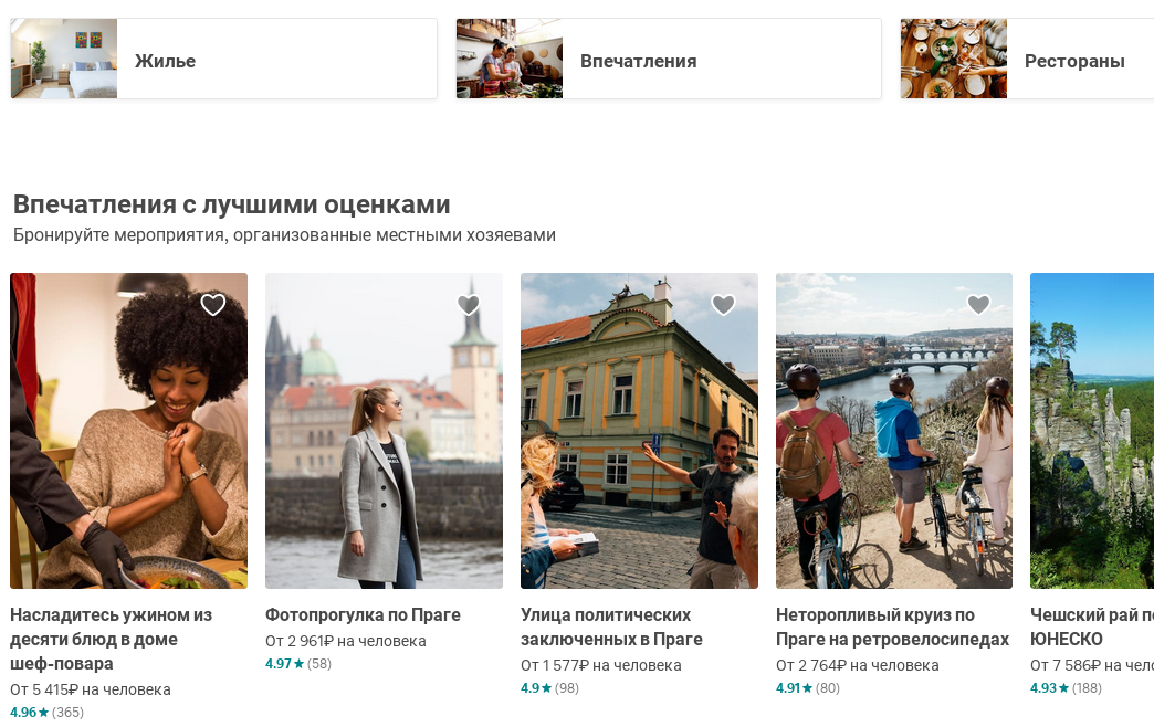
Having found in this mess not very noticeable button "Housing", we finally get to where the visitor of the same Booking is on the second click.
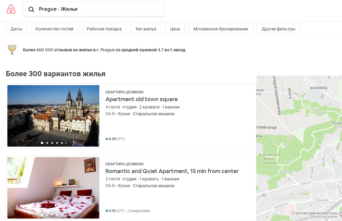
It seems to be all about business here - a list of offers and a map. There are some filters for searching. But even here the problem is that there is no sorting of objects at all. Here, it would seem, a map will help out, where objects are scattered with prices. It would seem-that's how easy it is to find an acceptable price/location ratio. But even here there is an ambush! The map shows the price per day, without taking into account additional fees (and discounts, too). the final price may be three times higher and you can only find out it by clicking on the item on the map. The list of items has the final price. if you hold your cursor over the item, its location will be shown on the map, but you can only work with the map and the list simultaneously on a high-resolution screen. On a mobile device, this is, of course, impossible in principle.
Booking and payment
To request a reservation, you must write a message where you are recommended to tell us about yourself, the purpose of the trip, and why you chose this accommodation. Who needs it? The host can view information about the client in the profile, where there is their data and photo, as well as read reviews of people who have already lived with the petitioner. As a result, a special phrase is written in the style of "Hello", which already stands as a hint in the field for entering the message. The most funny thing is that this banal stuff should be written even when booking automatically. Then everything is simple - the host agrees, often without even bothering to respond to the "greeting", and money is withdrawn from the customer's card. No preliminary negotiations with the owner are possible in principle, in fact, you buy a cat in a bag, and often it turns out that the owner can only accept you in the evening, although you arrived in the city early in the morning. You can, of course, cancel your reservation and request a refund, but you are unlikely to get 100% of your money - at least "Airbnb services" will remain with the service, and the host can assign the terms of return at its discretion, although of course, the customer can find out about this even before payment. In recent years, however, we have made a relaxation, you can refuse up to three times a year with the return of Airbnb services, but here again, some of the money can be squeezed by the host under the terms of return. Another important point: the customer receives the address of the apartment only after payment, before that, the location in the object description is given very roughly, although the house is indicated relatively accurately on the map. In Booking.com now there are also a lot of offers from individuals, but there you see the final price immediately, you do not require a prepayment, the address is immediately reported, and after booking you can freely communicate with the host, and the cancellation of the reservation in most cases is free. I think it is now clear why the choice, other things being equal, is in favor of Booking. Airbnb highlights the fact that it allegedly assumes compensation for financial losses in the event of a sudden cancellation of the host's reservation or when there is no communication with the host. Yes, I have had several cases where the compensation was enough to rent a house of the same class, even if the prices from the moment of booking have increased significantly. But even at the Booking office, I was able to settle cases of refusal of placement or double payment without delay, and I never lost a penny.
Change the payment details
Today I need to add a new Bank card to replace the expired one. Through "account settings" I get to the page "payment Methods", and click "Add card". This menu POPs up:
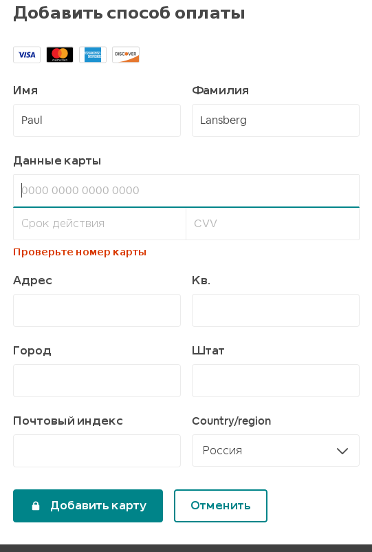
What does "first and last name" mean in this case? Since we are talking about a map, it is logical to assume that the name of the owner indicated on the map. The name specified during registration is helpfully displayed in the fields. It does not necessarily match what is written on the map, so I make corrections, enter the number and other data. After that, I am asked to fill out my address - why???!!! this information is not requested by more than one payment system!!. Moreover, my address is in my profile, so why enter it again? Well, I do this stupid requirement, click "Add a map" and watch the dots run on the screen for a long time. When I got tired of this, I went back to the "payment methods" page and found no changes there...I tried performing the operation three more times, including on other devices, with the same result.
Support
I
am approaching the deadline for the final payment of an already
partially underpaid apartment, but the card on which I made a
preliminary payment six months ago is already overdue, I can not
register a new card, and failure to pay will lead to automatic
cancellation of the reservation, due to my fault, of course. It remains to contact support. But it's not easy to find a page where you can report a problem. In
the main menu there is an item "Support", but to get to the question
input field you need to go through EIGHT pages filled with "valuable"
tips in the spirit of Captain Obvious, and more just useless writing
such as "Recommended articles", "where to start", "Partners and
community" and similar nonsense. Among all this verbiage, you will not immediately find a link for further progress on this obstacle course. Finally,
the desired field is opened, the question is written and sent, and the
message "you will be contacted in the near future" appears. How I will get an answer to my question is not specified. There is no point in waiting, so I close the page. After some time, I try to find my application and see what they advised me to do, but I couldn't find any traces of my message. What to do next - there are no ideas. But
I know that the Airbnb site regularly crashes in the evenings, which,
in General, is quite understandable, given the number of pages given to
the user.
In
conclusion, I want to add that all this is done on a desktop, not on
the worst computer, and with a recently updated browser. On mobile devices such as tablets and phones, this will take at least three times as long, if it works at all. I
haven't been able to log in to my account on a tablet for two years
now, not in the online version, not in the app, receiving a sneering
message "something went wrong", and recently the mobile app stopped
working altogether, and when I try to update it-"your device is not
supported".
Add-on:
I still added the Map, and as it is not surprising, from an old tablet,
through the simplest default browser, on which the Airbnb site stopped
working more than a year ago. During this time, apparently, "improvements" were made, after which the site stopped working normally in Firefox. The
most unpleasant thing is that all the collisions with the site occurred
in the course of my travels, where I sometimes had up to two dozen
armor plates. This
has not happened to the Booking site before, and it works fine on all
my devices, both through the browser and through the app. The
difference in house prices on both platforms is very often
insignificant, and I prefer to pay a little too much, besides in the
vast majority of cases, in fact, without prepayment, as well as with the
possibility of easy free cancellation, rather than having problems with
the site and settlement.